Falcon: Preference Setting Redesign
Falcon is a Fixed Income, Currencies, and Commodities (FICC) management platform that empowers over 1,000 institutional quants and traders worldwide to query and analyse market data.
As the system has matured, regional differences in data browsing among users emerged, and the current preference setting panel was gradually becoming unsustainable to accommodate the growing complexity of customisation needs.
Through UX analysis and co-creation, I reimagined its preference settings module, aligning it with various regional conventions and empowering it with more potential.
Company
HSBC
Year
2024
Duration
3 months
My Contribution
Wireframe
Card sorting
Prototype
Quality Assurance
Goal
Put New Wine in a Renewed Bottle
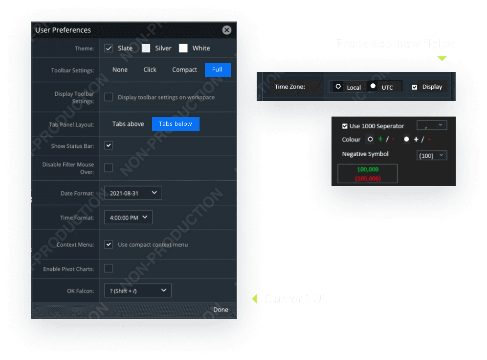
As the platform matured, there were more applications and a growing demand for customization. Hence, our team decided to revisit the User Preference design while adding new configurable fields.
Requirements
Revamp the Preference Settings UI/UX
Add new configuration options (timezone settings, number formats)
Goal
Put New Wine in a Renewed Bottle
As the platform matured, there were more applications and a growing demand for customization. Hence, our team decided to revisit the User Preference design while adding new configurable fields.
Requirements
Revamp the Preference Settings UI/UX
Add new configuration options (timezone settings, number formats)
UI/UX Review
Identifying and Validating UX Issues
At the beginning, I conducted a detailed review of the existing UI to formulate initial assumptions about the user experience. Then validated through discussions with the Business Analyst (BA). The following four findings highlight critical issues in the current design.
Lack of Categorisation
UX ISSUES #1
Sorting and grouping the fields can improve navigation and efficiency. Additionally, grouping can help users better understand the purpose of each field.
Unclear Labels and Effects
UX ISSUES #2
Some fields are unclear due to abstract names or the lack of immediate visible feedback after interaction.
Confusing Context-Specific Fields
UX ISSUES #3
Certain fields are only relevant to specific applications within the platform, leading to user confusion.
Design System Misalignment
UX ISSUES #4
The current UI does not fully align with the latest design system updates.
Wireframe
Communicating the Ideas and Interactions with Wireframe
After exchanging the initial ideas with BA and PO, I jumped into Axure and began wireframing the optimised information structure to improve the learnability of preference settings. The prototype was fully interactive, allowing stakeholders and users to explore and provide more valuable feedback.

Card Sorting
Co-create with the Users
To ensure the grouping made sense to most people, we found 7 users and facilitated card-sorting study. With very limited resources, I conducted the research with Power Point and made the hierarchical cluster analysis in Excel.
Card Sorting
Co-create with the Users
To ensure the grouping made sense to most people, we found 7 users and facilitated card-sorting study. With very limited resources, I conducted the research with Power Point and made the hierarchical cluster analysis in Excel.
Card Sorting
Co-create with the Users
To ensure the grouping made sense to most people, we found 7 users and facilitated card-sorting study. With very limited resources, I conducted the research with Power Point and made the hierarchical cluster analysis in Excel.

During card sorting sessions, I also asked users to explain the way they group the fields, how did they set up their preferences and their thoughts on the current preference settings panel. Then summarised the insights.
During card sorting sessions, I also asked users to explain the way they group the fields, how did they set up their preferences and their thoughts on the current preference settings panel. Then summarised the insights.
During card sorting sessions, I also asked users to explain the way they group the fields, how did they set up their preferences and their thoughts on the current preference settings panel. Then summarised the insights.
Frequently Used Fields
INSIGHTS #1
All users had adjusted colour themes, component header layouts, and data formatting.
Unclear Labels and Effects
INSIGHTS #2
Some fields were unclear in purpose.
Information Architecture
INSIGHTS #3
Users tended to further subcategorise fields, particularly those related to data formatting.
Prototype
Interactive prototype to communicate final UI, interactions, and specs
With the insight from the user research, I revised the design, creating a high-fidelity prototype and passing off final design specs through Axure.
Prototype
Interactive prototype to communicate final UI, interactions, and specs
With the insight from the user research, I revised the design, creating a high-fidelity prototype and passing off final design specs through Axure.
Prototype
Interactive prototype to communicate final UI, interactions, and specs
With the insight from the user research, I revised the design, creating a high-fidelity prototype and passing off final design specs through Axure.

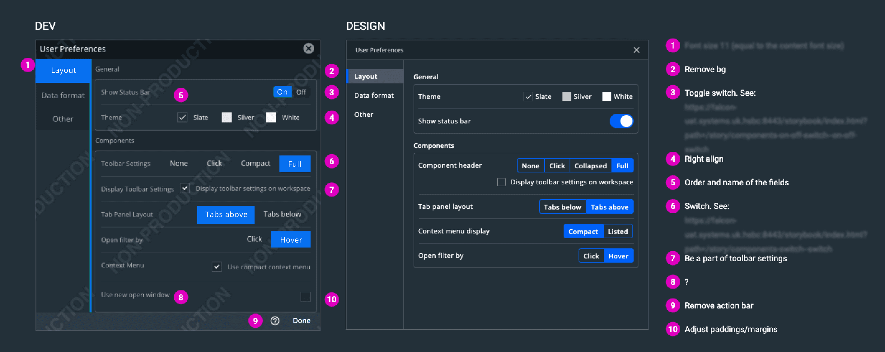
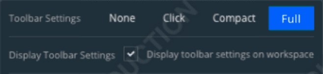
#1 Field Re-organisation
FINAL DESIGN
Based on user research, I found catagorise and sub categorise fields will help users faster locate a field and reduce congnitive load. Therefore I iterate my design with tabs and grouped fields

#2 Instant Visual Feedback
FINAL DESIGN
Due to legacy system constraints, the newly added data formatting configuration options only apply to certain modules in Falcon. To address this, I implemented instant visual feedback in the settings panel to show users the effects of their adjustmentsand added notifications within the module for clarity.
#1 Field Re-organisation
FINAL DESIGN
Based on user research, I found catagorise and sub categorise fields will help users faster locate a field and reduce congnitive load. Therefore I iterate my design with tabs and grouped fields
#2 Instant Visual Feedback
FINAL DESIGN
Due to legacy system constraints, the newly added data formatting configuration options only apply to certain modules in Falcon. To address this, I implemented instant visual feedback in the settings panel to show users the effects of their adjustmentsand added notifications within the module for clarity.
UI Review
Review the Implementation
To ensure high-quality implementation, I evaluated the UI developed by the IT team and collaborated closely to resolve any discrepancies and align with the design specifications.
UI Review
Review the Implementation
To ensure high-quality implementation, I evaluated the UI developed by the IT team and collaborated closely to resolve any discrepancies and align with the design specifications.
UI Review
Review the Implementation
To ensure high-quality implementation, I evaluated the UI developed by the IT team and collaborated closely to resolve any discrepancies and align with the design specifications.
Further Exploration
Think out of the Box
Although the task was completed, as a UX designer, I wanted to think more deeply about the underlying issues and explore opportunities to address them. Therefore, I conducted a detailed analysis of the preference setting fields, the related functionalities, and identified potential directions for improving usability in the future.
Fields and Layouts
NOW
Add fields in User Preferences to fulfil the current requirement; improve the UI without changing its functionality
System and Interactions
NEXT
Review and analysis the functions behind settings, user feedback, and the design works UX team proposed. Finally made system-level improvements.
Future Preference Settings
FUTURE
Consider the trends of technology and use future thinking to explore the possible directions of preference settings and related systems.
The Preference Setting Field
The Related Function
The Revamped Design